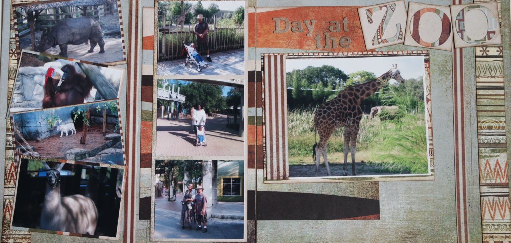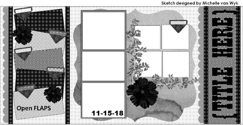
When I originally looked at the sketch that inspired this layout, I was so focused on the center part of the design that I was actually intending to create a single page layout. I decided on this double page layout when I realized how many photos I had taken during this trip to the zoo with family and close friends.
Yes, I was there even though you would not know it looking at the layout. There were some photos that I was in but they didn’t make the cut. LOL 🙂
Meanwhile, the layout does make it clear what one of my favorite animals is by the spotlight on page two of the layout. I love giraffes – at the zoo, in pictures/paintings, on acrylic stamps, on scrapbook paper, on notebook covers. There is something just so interesting and majestic about them. I have always been a fan.
Okay, on to the sketch:
I used a very old line by Basic Grey called Archaic. It is discontinued but there are a lot of cute zoo-themed paper lines to choose from like the Doodlebug zoo collection among others.
I usually struggle with titles but I like how this title turned out. It is simple and I like simple.
Stop by Let’s Scrap Sketches to see the design team layouts and play along with us. We’d love to see what you create!

